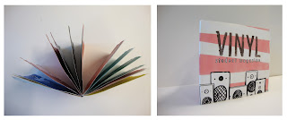
Student zine for Weston college
Starting by looking into existing zines I came across these on the creative review blog. If you follow the link it takes you to the page where there are a couple more on the creative review website.
What I learnt from looking into existing zines is that they are generally small hand made magazines. Unlike glossy magazines in the shop they are more 'designed' and have more heart. Many of the illustrations throughout are hand rendered as is the typography. They are a lot more artistic than your general magazine and is more like something you would choose to keep.
For my student magazine I was given the title Vynil, and it was to be based on the idea of music, but its not solely about music. I decided to go with a retro/kitsch themed cover, then using mixed various media make the inside vibrant and carrying the same theme throughout.


No comments:
Post a Comment