Friday, 30 September 2011

Tutorials


'A tutorial is one method of transferring knowledge and may be used as a part of a learning process. More interactive and specific than a book or a lecture; a tutorial seeks to teach by example and supply the information to complete a certain task.
Depending on the context a tutorial can take one of many forms, ranging from a set of instructions to complete a task to an interactive problem solving session'
Something We are doing this year is creating tutorial sheets to book appointments with our tutor with a list of aims and objectives that we want to discuss. We are to design our sheets and come up with a presentation around this, and I created a short cartoon of these 2 owls to describe what a tutorial was. I chose to base it around owls because they are often related to education and thought of to be wise. I also imaged my tutor as a wise owl passing on her knowledge to me!


Monday, 26 September 2011

The Quesiton

For todays lesson we had to have our proposed question that we intend to answer though designed information ready. 


Can Designed Information Reduce Anxiety Levels Within Patients Throughout The Duration Of Their Hospital Stay?


I have been working in Weston General Hospital as a housekeeper for 3 and a half years now alongside my studies so the 2 environments to me are linked very closely. I enjoy working in the hospital and feel a sense of pride from being involved in a corporation that is there solely to help people. Even though i am not a nurse or doctor my part in the hospital is still an essential one and together we all make the work done by the NHS possible. However over the years I have noticed that the hospital can be a very distressing environment for some people.  As the staff already have so much to do within their work and so many people to cater for, it makes it difficult for anyone to directly comfort everyone as this is not their prime occupation. This got me thinking about what is already in place in the hospital to make a stay more comfortable for example Sunshine Radio is a free service to patients that might not necessarily be aware of the fact that its in place. So im starting to generate general ideas around some sort of welcome pack 

Saturday, 24 September 2011

A Is For Advertising


Today I began designing an screen printing my alphabet. I began here with A for advertising. I have decided to use 3 screens for each one so that each one only uses 3 colours and I intend to make them all follow these sort of shades. I really particularly like the man on the ladder I think using a person makes the image more life like.


Thursday, 22 September 2011

The A-Z of graphic design

Thinking about my graphic design alphabet I started to get a little stuck on some of the letters so today I decided to write them so that when I came to design each one I could just get on with it instead of sit there humming and haring wondering which word would be the most appropriate! Feel free to comment if you have any other ideas of words I could use

A - Advertising

B - Branding
C - Colour
D - Drawing
E - Equipment
F - Flyer
G - Graphics
H - Heirarchy
I - Illustration
J - Juxaposition
K - Kerning
L - Letter press
M - Macbook 
N - Net
O - Opacity
P - Packaging
Q - Quality
R - Render
S - Screen Print
T - Typography
U - Use Value
V - Visual communication
W - Width
X - X height
Y - Y Height
Z - Zine

Paul Thurlby

Looking at my identity I feel that its essential for me to revisit the design of it so that the rest of my work pieces and presentations can follow the same design.  The reason being is because the current identity that i have been using doesn't have a strong enough concept and it is more about style over substance so i really want something that has a strong idea behind it. I have been thinking about how Ab-z is the beginning and end to the alphabet so my research as led me to looking into some illustrated alphabets and in particular this Paul Therby one stood out to me the most because I love the screen printed illustrations within it and how each thing goes into the shape of the letter that it is conveying. The use of color and style gives it a vintage look that I think is adorable. I loved it so much I decided to buy it! It also gave me the idea to print my own alphabet but an A-Z of graphic design version. 


Monday, 19 September 2011

Quantitative & Qualitative Data Collection


For our first timetabled day back at university from the summer we had a presentation day for quantitive & qualitative data collection which we were asked to research and put together during the summer. The reason being to inform our research proposals for this year.
Quantitative
. Quantitative data collection involves surveys and customer questionnaires, which can help you to improve your product and services by enabling you to make more informed decisions
. Its about asking people for their opinion in a structured way to inform your ideas
. To get reliable results it is important that you survey people in large numbers to find a more accurate results.
. Questionnaires can be done 
face to face
over the phone
via post or email
online or via your website
Quantitative research can also be used to compare certain groups of
people to minimize your results and target a certain audience
By repeating surveys you can compare and monitor how opinions change
Quantitative research can be usd to inform your work before the design process, then test the performance of your design afterwards.
Qualitative
Qualitative research aims to provide an understanding of why or how things are as they are. Exploring issues, understanding phenomena and generally answering questions. For example a market researcher may ask a customer how they came to the decision to buy into a certain product.
Unlike quantitative date  collection where there are fixed questions, qualitative data collection would be more of a discussion or topic guide used to explore various issues in depth Feedback: Generally quite impressed, my presentation was a bit to basic, but my understanding of it was recognizable and clear to the audience. Styling, explanation, conduction and examples are some of the key things to think about when putting together a presentation. Quotes are a nice way to break things up and added extras for the audience is a nice way of keeping them engaged. Anything like photographs, video and music can also add a nice touch to any presentation.


Wednesday, 23 March 2011

Identity

Keen to experience Graphic Design in the working world I have been creating this identity for myself to send out to various design and illustration companies. I went through a series of processes and design options beginning with a series of playful business cards leading onto direct mailer options many conveying characters that I had created. Branding myself and finding one specific identity for myself has been an interesting journey and in the end I decided I was not one thing, but many. So the mix and match series of squares I feel mirrors my personality. 


Vinyl - Student Zine Revisited

Looking back through my original zine design, as much as I liked the use of color during the design process, now its all put together I feel that the backgrounds may be a bit to 'eyebally' and the typography needs to be revisited.

No. Zine
As part of the redesign to my zine I also revisited the research I had done into the zine and I came across No. Zine. Here is the description of No. Zine from the website 

No.Zine is an independent arts zine, released in series and featuring a variety of young artists, designers, writers, photographers and illustrators. Each issue is conceptually centred around it's issue number.
Curation, illustration, design and art-direction by Patrick Fry with the help of many great contributors.


No.Zine can be found in many
small bookshops and art spaces
around London.


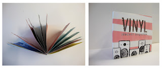
Here is my zine, revisited. I feel it flows a lot better, has a crisper clean feel to it, and the typography has been done to a higher level.


Monday, 21 February 2011

Design

It’s art if can’t be explained.
It’s fashion if no one asks for an explanation.
It’s design if it doesn’t need explanation.
— Wouter Stokkel

Telegramme Studios

Telegramme Studios state they are the purveyours of fine design and illustration on there website, and im going to state 'agreed!' There work is interesting and constantly conveys a hand rendered approach. There a london based company who again use a lot of screen print.


Monkeys, Ducks and Mice, Continued

The continuation of monkeys ducks and mice then lead me on to creating these fun cards. It was actually after some research into Aardman's work and these cards create a more comic image. I think there fun and quirky but they seem very photoshopped even thought the illustrations are hand rendered. I would like to try something with screen printing.


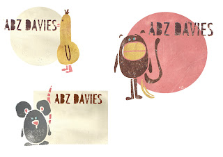
So after this i went on to create these 3 characters out of my illustrations but from using painted backgrounds to give them a more handcrafted look. I Think that the colors used on the monkey are the most effective and ive also noticed how the duck now looks more like a chicken!


Charley Harper

August 4, 1922 - June 10, 2007

Charley Harper was a Cincinnati-based American Modernist artist. He was best known for his highly stylized wildlife prints, posters and book illustrations.Im particularly drawn into Charles's work because of the smooth perfect lines and the geometric form most the animals in his work convey. There simple but very effective. I also notice how the majority of his illustrations are of animals and nature which i connect with because I rarely draw human forms myself.


Tom Frost

Tom Frost is an illustrator living and working in Bristol. He uses screen printing, acrylic paint, bits of wood, gocco machines, pencils, vintage Meccano and paper to create hundreds of beautiful prints. I really love his work and if you follow this link you will find his blog, also here is a small selection of prints.


Sunday, 20 February 2011

Monkeys, Ducks and Mice

To begin the construction of a personal identity for myself i sent around a questionaire asking people to compare me and my personality to various things such as food, an accesory, a shape ect and for animal most came up saying, a duck a monkey and a mouse. I did a few pages of random drawings and doodles of these in prepeartion of designing a series of playful business cards.


I liked the animals faces and was thinking about what i could do with them. I wanted to do something fairly simple so i decided to just use the eyes and mouths so that the rectangle of the card makes up the face. Here is a photograph of these cards together which look very cute as a set together. Id like to continue to develop on this idea but will come back to it once i have explored other possibilities. 


After this i moved onto looking into paper mechanics. I thought the duck could look quite effective as a pop out card and i created 3 cards, one sunny, one raining, and one snowing. The concept being that I am perfect for what ever the weather.


Mike Perry Skate Boards

I was looking through Mike Perry's blog the other day and i saw these hand rendered skateboard designs,  i love how busy they are the fact that theres so much to look at draws me in. The color combinations are bright and eye catching and the general feel to them are well fitted to the skate scene. If i could skate board, id skate on a Mike Perry one!


Thursday, 27 January 2011

Typography

" Faces of type are like men's faces. They have their own expression; their complexion & peculiar twists & turns of line identify them immediately to friends, whom each is full of identity "

- J.L Frazier

Fountain Timber

Fountain Timber, a timber company in north somerset set out to 4 colleges set out a brief to design an advertisement for end of winter/early spring time. Weston college was not only lucky enough to win all 3 prizes, but i was lucky enough to win 1st prize with this advertisement. It was used on the internet and in magazines.

Burroughs Dance Center

My younger brother is a British champion ballroom dancer and i noticed that his dance school didnt have a logo or an identity. It began as a small project for pleasure to design a logo and corporate identity to keep my mind going over the summer. But then after i showed his dance teacher the ideas i had come up with she really liked it and decided to run with it. It now printed on t-shirts, flyers and various web pages


Tuesday, 25 January 2011

Identity

Carrying on from the I Am Me What Shall i be brief i then went on to begin my ideas in creating some playful business cards to send away to various companies in aid of getting a work placement. I began looking into some free standing pop out business cards


From this I went back to the tree I made from I Am Me What Shall I Be and made my own version of a pop out business card here are some photographs i took.


Transition

A flyer for an applied arts showcase. Simply a flyer that reflects the word transition. Researching into transition i discovered that in the periodic table there is a group of elements called The Transition Metals. Studying this i found that mercury is one of these transition metals and that i had access to some in the science department of the university. Here are some photographs i took of the mercury.


I particularly liked the photograph on the right, the closeness of the shot made the light reflection and pink color which i thought was a really nice effect. 

Baskerville

Researching to typefaces i found that Baskerville is one of the transitional or baroque serif typefaces that first appeared in the mid-18th century. They are among the most common, including typefaces such as Times New Roman. They are in between modern and old style, thus the name "transitional."

I then combined this typeface with my photograph to create this flyer

A Chorus Line

Live Brief
A Chorus Line - A Footlights production, as me to create a logo and corporate identity to help promote their production.


This was the origanal art work for the production. A Chorus Line is a musical about Broadway dancers auditioning for spots on a chorus line. I wanted to reflect the goal the broadway dancers were working towards. Here is the logo and graphics i created for them.


Vynil

Student zine for Weston college
Starting by looking into existing zines I came across these on the creative review blog. If you follow the link it takes you to the page where there are a couple more on the creative review website.


What I learnt from looking into existing zines is that they are generally small hand made magazines. Unlike glossy magazines in the shop they are more 'designed' and have more heart. Many of the illustrations throughout are hand rendered as is the typography. They are a lot more artistic than your general magazine and is more like something you would choose to keep.

For my student magazine I was given the title Vynil, and it was to be based on the idea of music, but its not solely about music. I decided to go with a retro/kitsch themed cover, then using mixed various media make the inside vibrant and carrying the same theme throughout.


A World In Words

Researching Langauge In Social Context as a broad subject my next brief was to created a short creative publication based on my research. When researching Language within social context i came across animal and insect communication and found myself very interested in how ants communicate by leaving each other chemical messages and how there are much like humans in that they wage war agaist one another ect. Thinking about how ants work i began some research in how i could use typography to reflect this. These are a few pictures i found on the internet whilst researching highlighting ant behaviour.
is also a publication i looked into

Next i started researching typography which i feel reflect this. Here are just a few pieces that i found whilst researching on various websites. I used words such as flowing typography, following typography, bitty typography, as i felt these word descibed ant movement the most effectivly.


After This i went into my own design work. I decided to keep to blacks and greys and use no imagery so i can the strongest feeling of ant communication throught typography alone, my publication is solely going to rely on typography. Each page leads onto the next in that the sentence or word each page ends with is not the full stop but carries onto the next page this is to hightlight the fact that ants follow each other. Something i thought about a lot wile doing this was how

 'when were in a plane, looking down on the world, the world looks like tiny ants'

i wanted to reflect this thought and how the size of ants relate to us.